TOWN OF NORMAL
Communications Department INTERNSHIP
The Town of Normal, in Illinois, “offers unparalleled connectivity, a strong and diverse economy and high quality of life making it a prime destination for businesses and talent alike”. This governing body strives to grow with and for the community. It oversees many local amenities including the Normal Theatre, Children’s Discovery Museum, aquatic facilities, and parks!
During my three-semester internship with the communications department, designing within a small but mighty team of close-knit associates who care deeply about their community, I observed how local government functions while honing my illustrative and with guidance from the team’s graphic designer, Kelli Aho. I created many unique, diverse digital and print advertisements for local events and amenities as well as aided in more supportive tasks like quick updates to body copy, making testimonials or holiday social posts, or creating street and parking signs. Most of my projects focused on the Parks & Recreation, Cultural Arts, and Uptown Normal departments, and I occasionally worked with other branches.
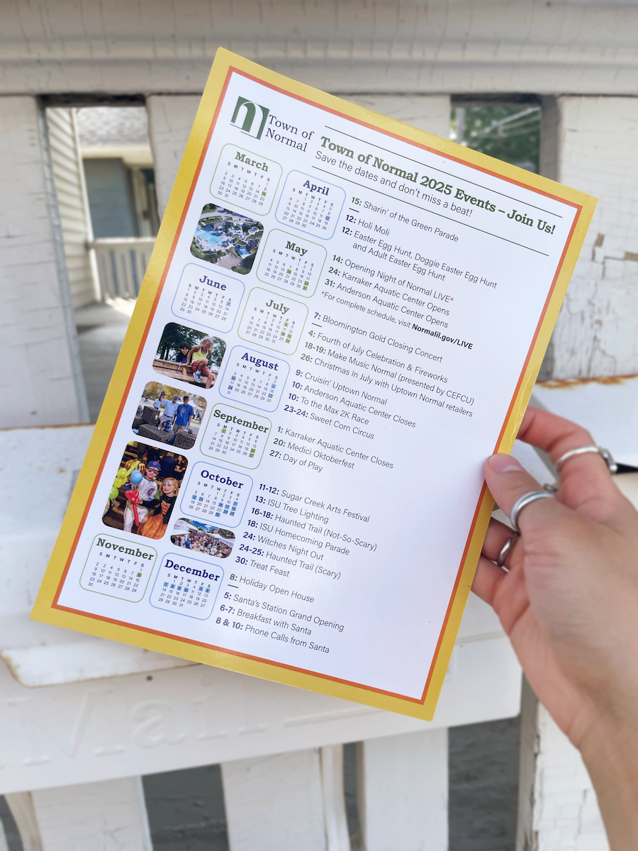
ANNUAL TOWN EVENTS DIRECT MAILER

Each year the Town of Normal sends out a direct mailer that features the local major events. Because some months are busier than others, the layout of dates needed to be flexible while still maintaining a sense of consistency and order. To achieve this, I made each month’s micro-calendar the same size and paired the months that had a fewer amount of events. I differentiated the paired months and their events by separating them with alternating colors.


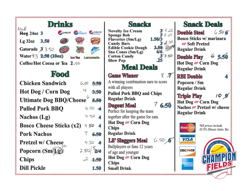
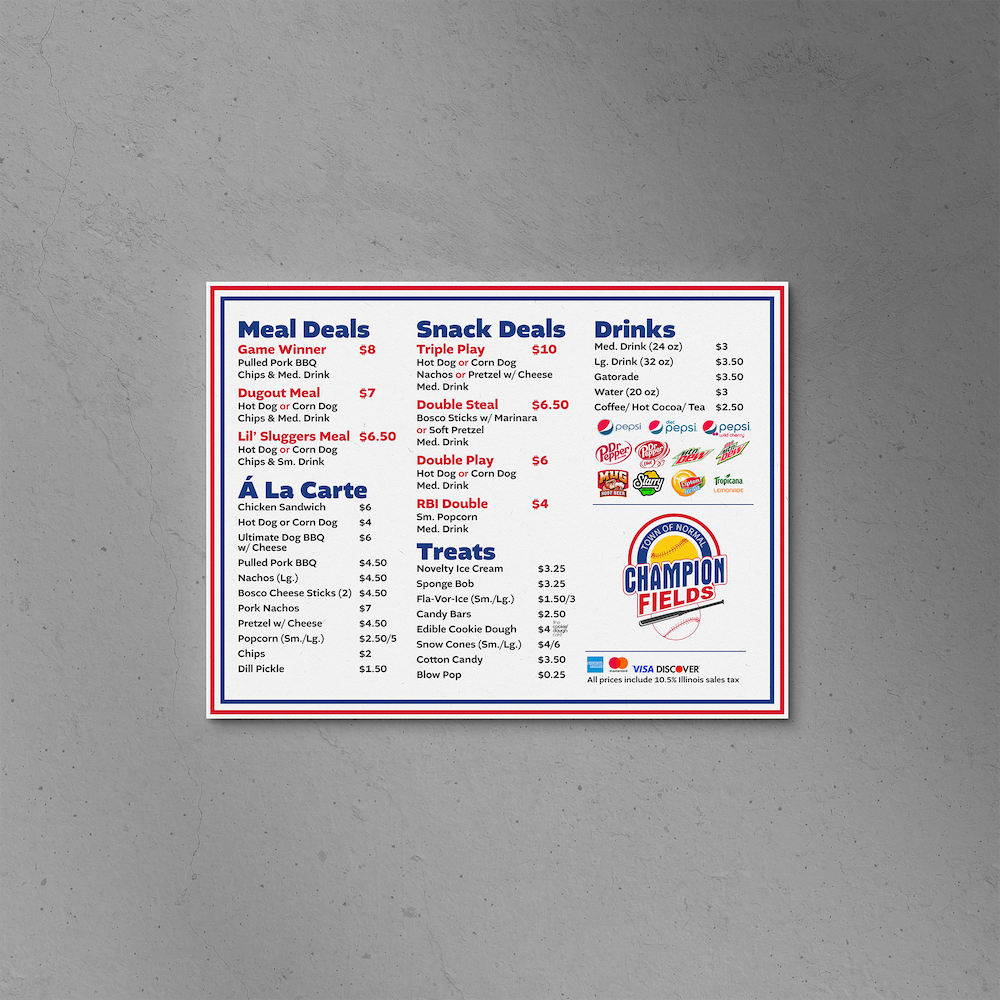
CHAMPION FIELDS CONCESSIoNS MENU
Champion Fields is a sports complex at Maxwell Park. While making annual updates to the concessions menu prices, I had the opportunity to refresh the design. The original menu was relatively straightforward, but lacked cleanliness and some hierarchy. I chose a new font and updated the colors to compliment the logo and focused on typography (specifically size and spacing) to make the information easier to understand and digest (pun not intended but welcomed!) I also rearranged the categories to make the meal combinations more prominent. The original menu is shown below.
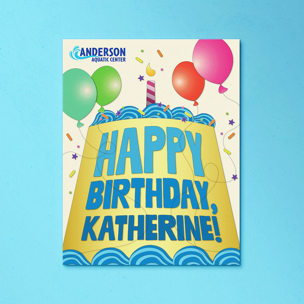
AQUATICS CENTER BIRTHDAY POSTER
The Town of Normal oversees two aquatic centers (Karraker and Anderson), and both locations are rentable for birthday parties. For these private events, the facilities provide food, balloons, and a large-sized poster with the name of the celebrated child. The existing poster was visually flat and oversimplified, so I created a new poster that pictures a larger-than-life cake to celebrate the momentous occasion. The hues of blue compliment the Anderson Aquatic Center’s logo while the warm and pastel colors pull from the Karraker Aquatic Center’s Logo; these combination of colors allow the poster to be used at both locations. The child’s name is positioned at the bottom of the cake, where it has the most room and can adapt to longer spellings.

AMTRACK SIGNS

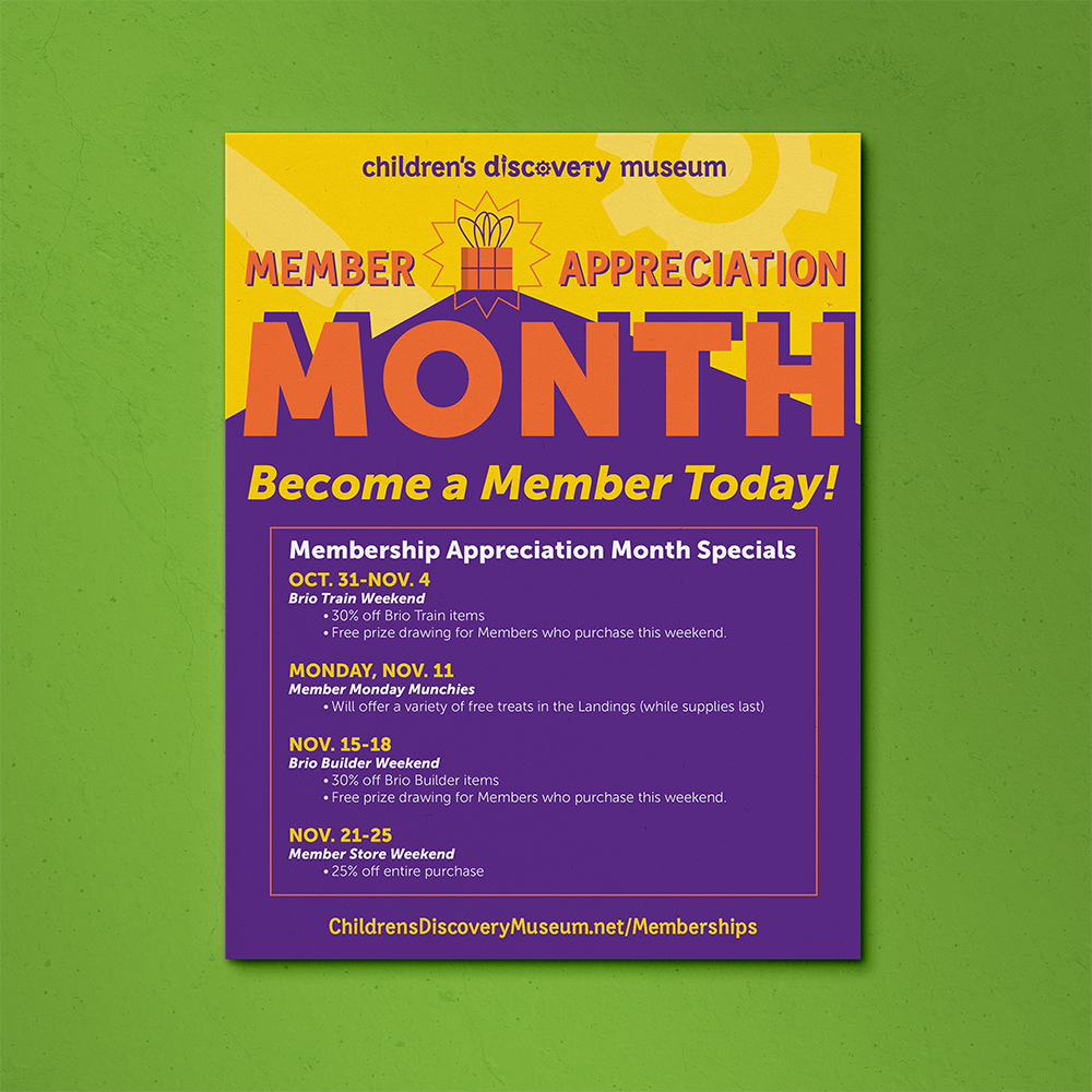
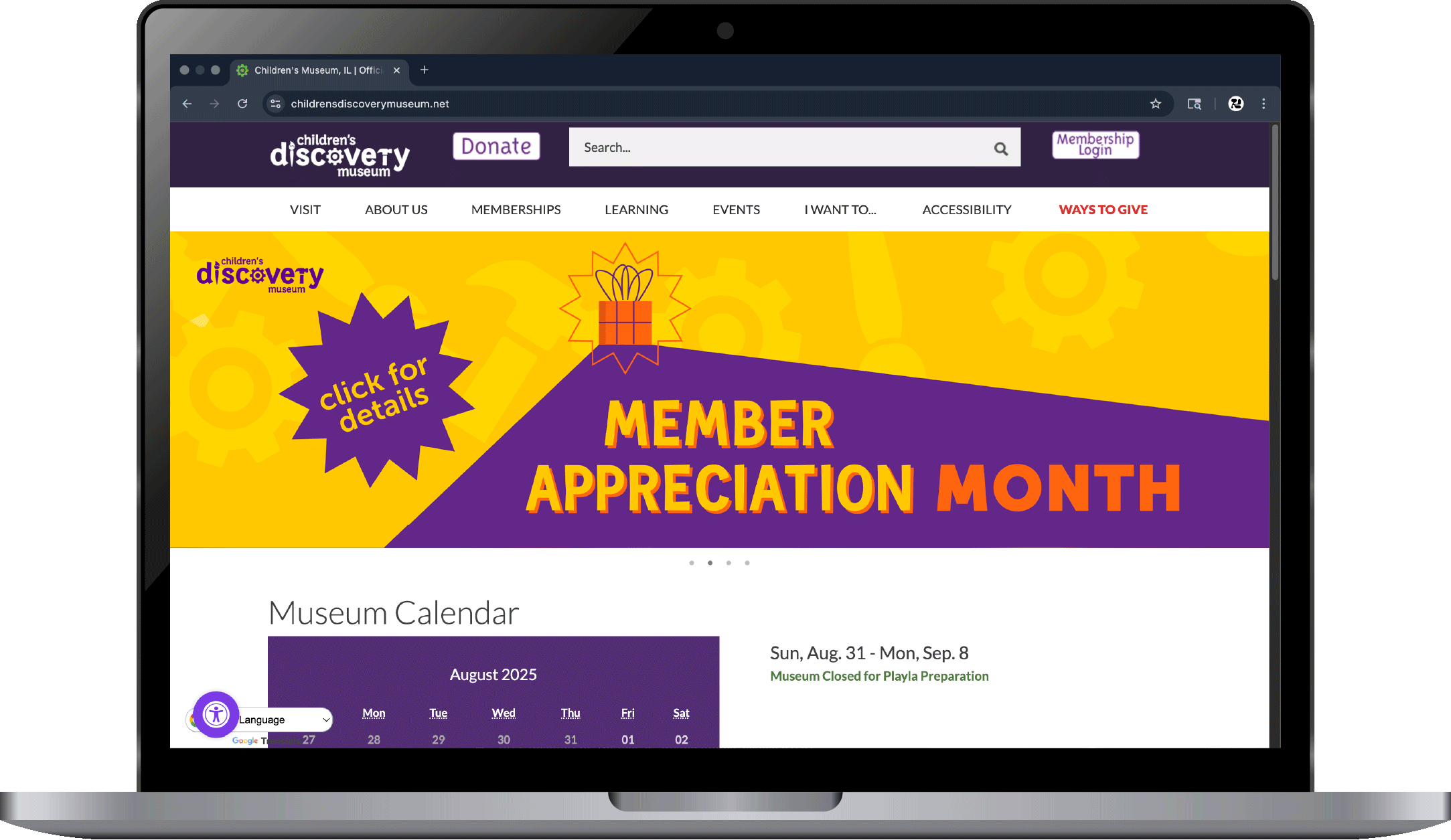
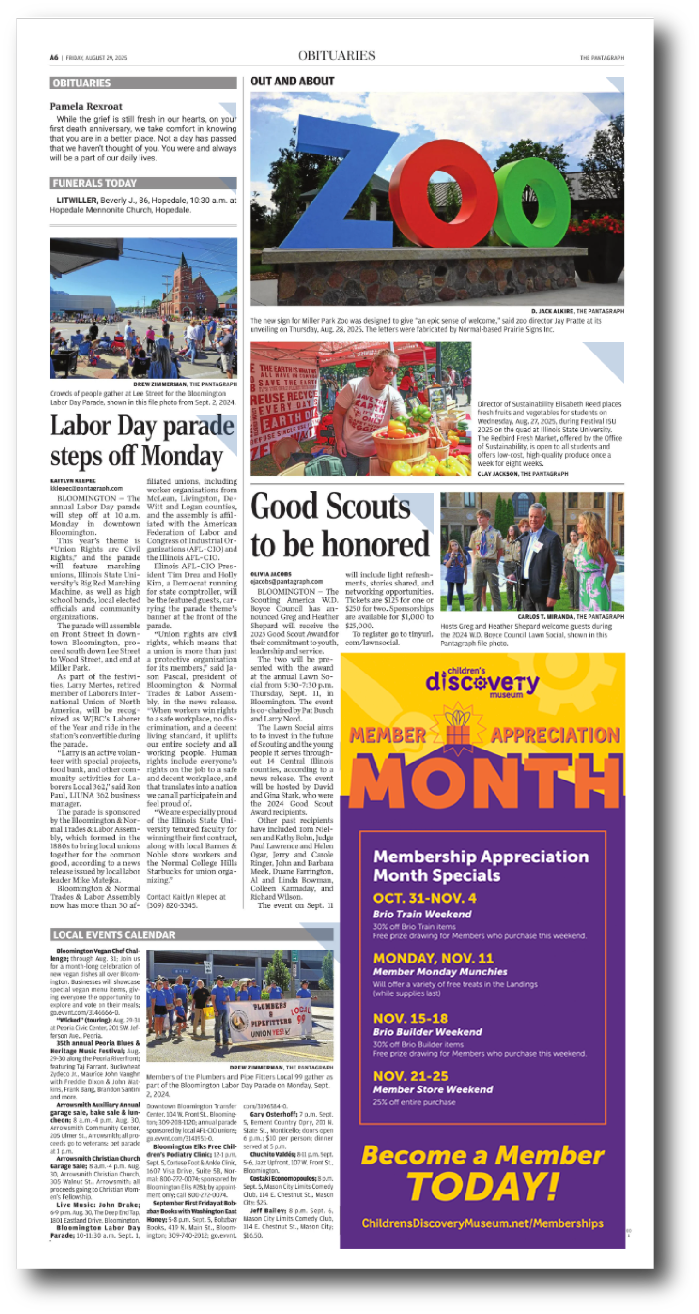
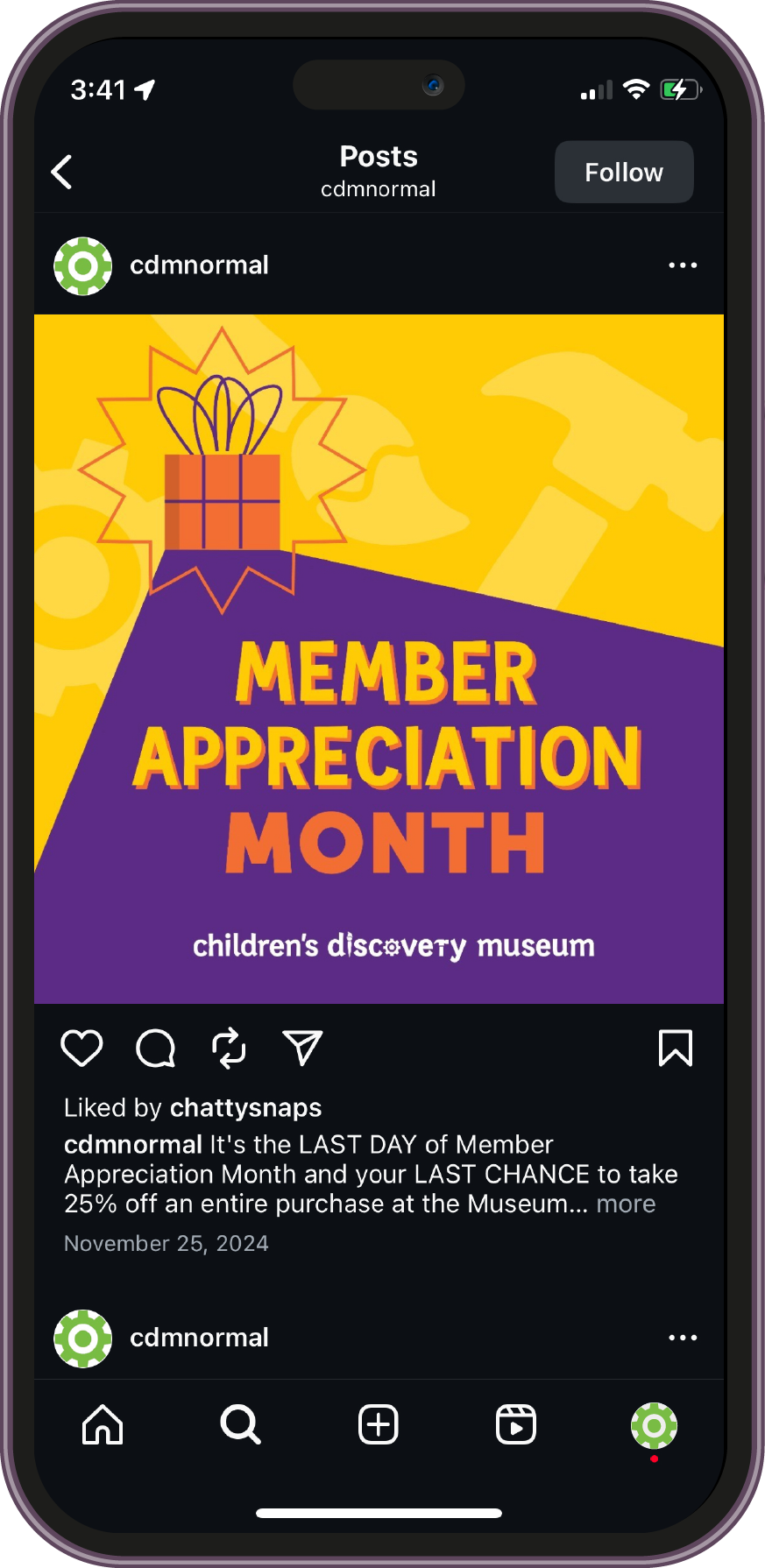
CHILDREN’s Discovery Museum Member Appreciation Month AD MATERIALS
These materials for the CDM’s Member Appreciation Month reused the small present motif that has been featured in some of their past advertising campaigns. Using the Museum’s existing color palette, I incorporated the present as a focal point in the composition and used contrasting light and dark colors to draw attention to it. The placement and shape of the larger blocks of color create a foreground and background for the present to sit in between that mimic a bright light (yellow) casting a dramatic shadow (purple).